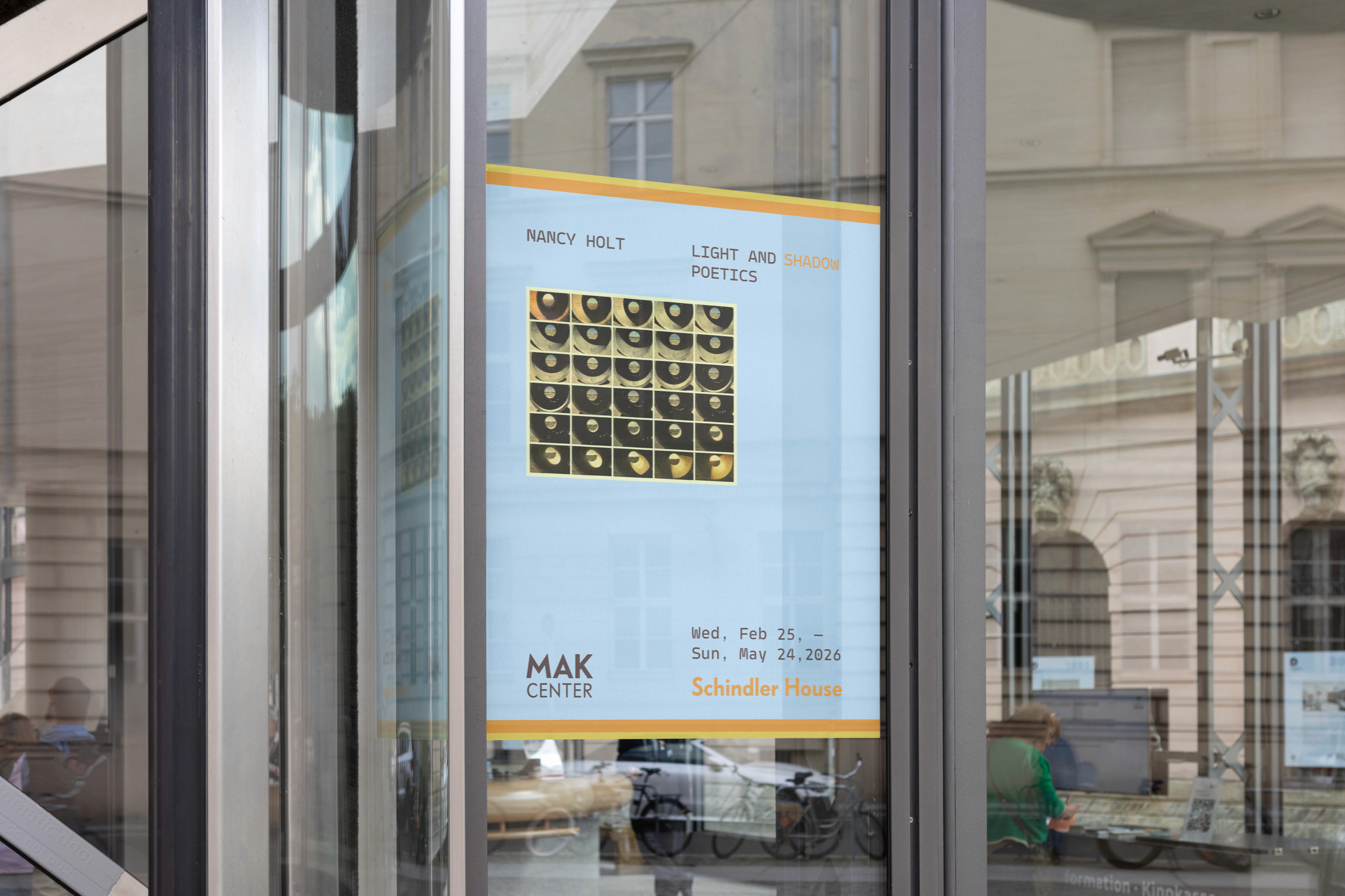
Context: Visual Identity, Branding, Self-initiative
Timeline: (2026)
Tools: Figma, Adobe Photoshop, Creative Coding
The intention behind this self-initiative visual identity project is to reflect my personal experience from visiting the Schindler house. I wanted to reflect the feeling of being surrounded by natural rhythm, open modular space, and the texture from the building's materials.
Also, the original concept is from 1995. The logo tries to literally embody the tension between 2D and 3D, art and architecture. But MAK Center today is described as a cultural think tank that tests disciplinary boundaries. That's a more alive idea than what the current branding communicates. So this brief was made to feel more experimental, multidisciplinary, a little unpredictable.

Color from nature
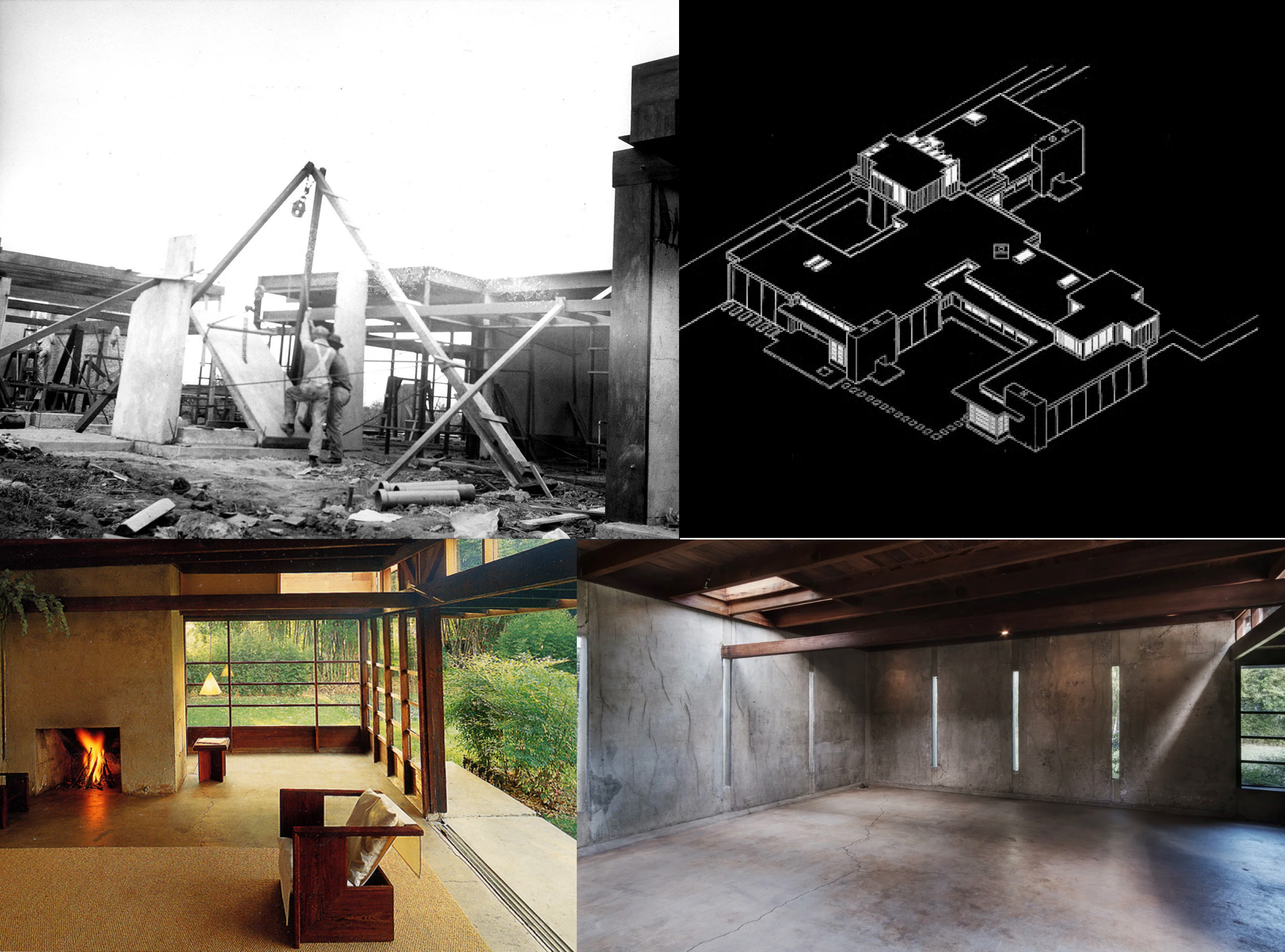
Close up images that you could find within the Schindler house and this palette depicts the range of spaces within Schindler's design.

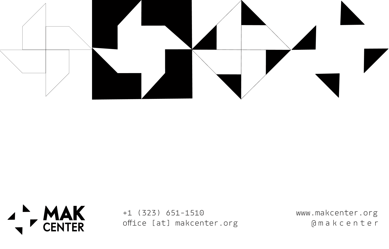
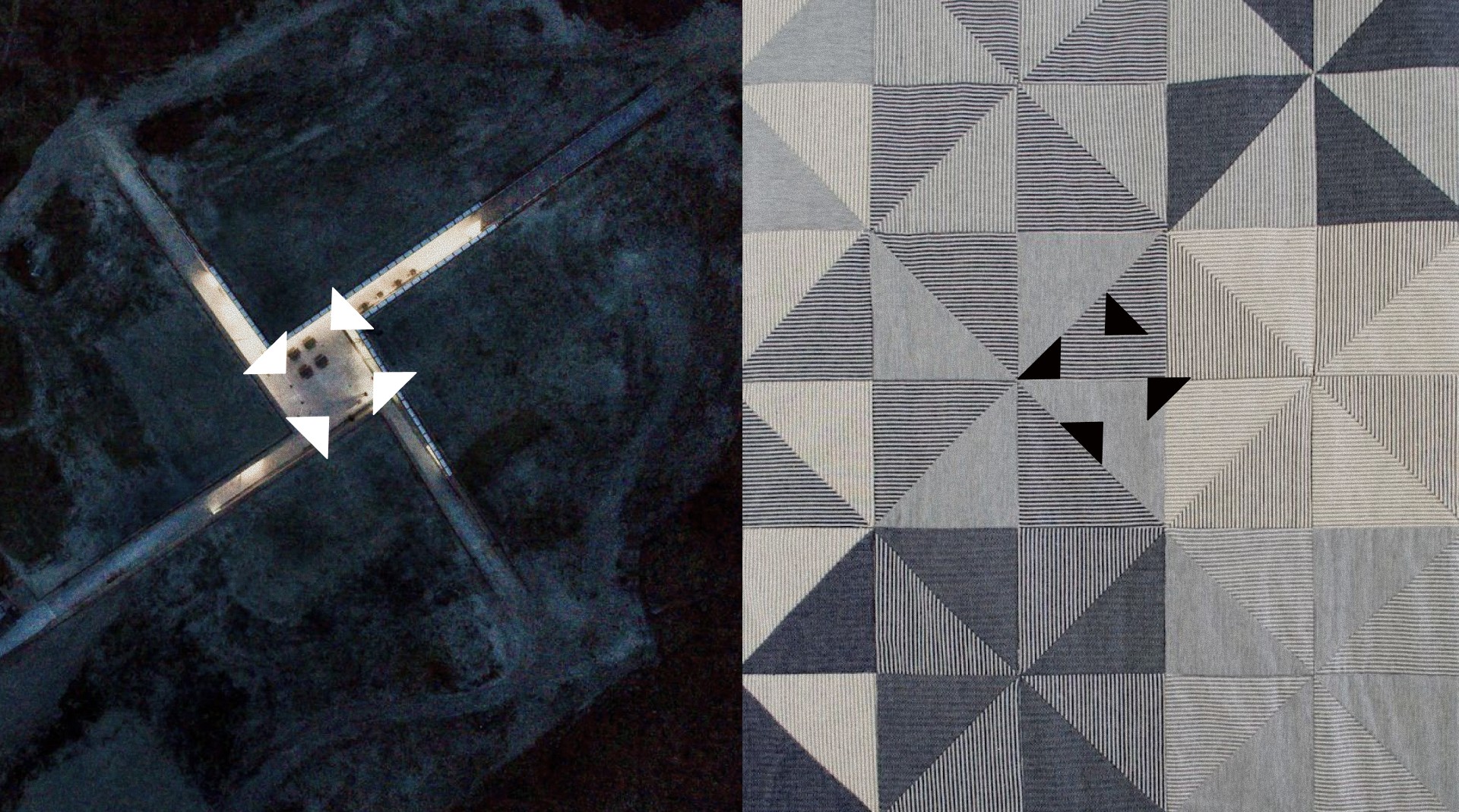
Defining the shape
I heavily based the visual identity based on the architectural plan of the Schindler House, which is the main address for the MAK Center for Art and Architecture. The house has a unique pinwheel based design where the structure proposes a rethinking of space as an open, communal system.


This simple pinwheel form reflects the structure of the Center throughout the system.